
Tips for Designing Apparel Graphics That Work With Dye Sublimation
PAGE
By PAGE Editor
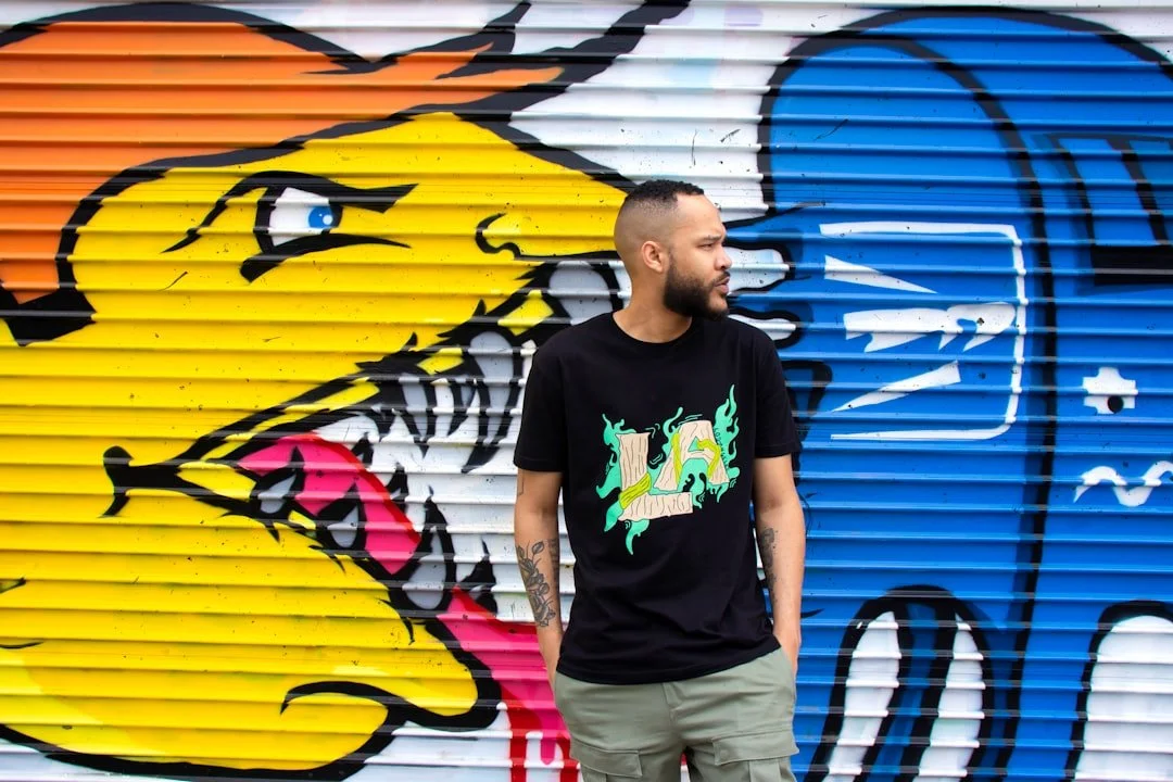
Dye sublimation has become a popular apparel decoration method because of its vibrant color results and long lasting durability. However, successful sublimation starts long before printing and begins with smart graphic design choices. Understanding how colors, layouts, and fabrics interact with sublimation helps designers create apparel that looks polished and professional.
Understanding the Basics of Dye Sublimation Printing
Dye sublimation is a heat based printing process that bonds ink directly into polyester fabric fibers rather than sitting on top of the surface.
This process works especially well with versatile dye sublimation transfers offered by DTF Virginia, which support consistent color output, smooth gradients, and dependable wash performance across many apparel applications.
Designers using these transfers benefit from breathable prints that maintain clarity without adding texture or weight to the garment.
Dye sublimation works best on light colored polyester fabrics
Ink becomes part of the fabric instead of forming a raised layer
Colors appear more vivid and long lasting than many surface print methods
Designs remain soft and breathable after pressing
Ideal for performance wear, promotional apparel, and fashion pieces
Designing With Fabric and Color Interaction in Mind
Sublimation printing bonds dye directly into fabric fibers, which means design colors interact with the garment itself. This makes fabric choice and base color critical for predictable results.
Because sublimation ink is transparent, the garment’s color influences brightness, contrast, and accuracy. Designers must plan artwork carefully to avoid dull tones or color shifts.
1. Choosing the Right Base Garment Color
Light colored garments provide the best canvas for dye sublimation since there is no white ink involved in the process. White and pastel polyester fabrics allow colors to appear vibrant and accurate. Dark garments typically mute or distort colors, which can reduce design clarity.
2. Accounting for Fabric Texture and Weave
Not all polyester fabrics produce the same result, even when sublimated correctly. Smooth performance fabrics usually display finer detail and cleaner edges compared to textured or loosely woven materials. Designers should test prints on the exact fabric type being used to ensure consistency.
3. Understanding Color Transparency in Sublimation
Sublimation inks are translucent, meaning the garment color will show through the design. This characteristic requires designers to adjust color selections accordingly. Using bold, saturated colors helps maintain visibility and contrast.
4. Avoiding White Elements in Designs
Since sublimation does not print white ink, any white areas in the artwork will simply show the garment color. Designers should plan artwork accordingly and avoid relying on white text or highlights. Creative use of negative space can still achieve clean results.
5. Testing Colors Before Full Production
Color output can vary depending on heat, pressure, and fabric type. Running test prints allows designers to fine tune colors and avoid surprises during production. This step is especially important for branding consistency.
Creating Artwork That Maximizes Print Quality
Creating artwork with proper resolution, balanced color profiles, and clean edges is critical for achieving sharp sublimation prints. Well prepared files help prevent color shifts, alignment issues, and loss of detail during the heat transfer process.
Designing at the Correct Resolution
Artwork should be created at a minimum of 300 DPI at full print size. Low resolution images can appear blurry or pixelated once sublimated. Vector files are ideal when possible for scalability.
Using RGB Color Mode for Better Accuracy
Sublimation printing relies on RGB color profiles rather than CMYK. Designing in RGB helps maintain color vibrancy and reduces unexpected shifts. Always confirm printer settings before finalizing files.
Keeping Line Weights Appropriate
Extremely thin lines may fade or disappear after sublimation. Designers should slightly thicken fine details to ensure visibility. Balanced line weight improves overall readability.
Avoiding Overcrowded Designs
Simple layouts often perform better than overly complex ones. Crowded artwork can lose clarity once transferred to fabric. Strategic spacing helps designs breathe and remain visually appealing.
Preparing Files for Heat Transfer Alignment
At this stage in the design workflow, many decorators partner with experienced providers like dtfvirginia.com to ensure artwork translates cleanly from screen to fabric.
Working with a reliable transfer source helps reduce production errors while maintaining consistent results at scale.
Additional Benefits and Strategic Design Insights
Beyond visual appeal, well designed sublimation graphics also improve garment performance and longevity. Thoughtful design choices enhance wearability and customer satisfaction.
1. Enhancing Comfort Through Design Placement
Sublimated designs do not add weight or stiffness to garments. Placing graphics strategically helps maintain comfort during extended wear. This is especially important for athletic and work apparel.
2. Improving Durability Through Smart Color Choices
Highly saturated colors tend to hold up better over time. Avoiding overly subtle tones can improve long term vibrancy. Consistent heat application further protects design longevity.
3. Aligning Designs With End Use Scenarios
Designs intended for sports apparel differ from casual fashion pieces. Understanding how garments will be worn helps guide layout and scale. This leads to better user experience.
4. Supporting Brand Consistency Across Apparel Lines
Sublimation allows consistent color matching across multiple garment styles. Designers should standardize color palettes and design templates. This strengthens brand recognition.
5. Reducing Waste Through Efficient Testing
Testing designs before full runs minimizes misprints and fabric waste. Digital proofs and small batch testing are cost effective strategies. Sustainable practices matter to modern consumers.
Common Mistakes to Avoid in Dye Sublimation Design
Even experienced designers can encounter issues when transitioning to sublimation. Recognizing common pitfalls helps avoid costly errors.
Using dark fabrics that reduce color visibility
Designing with white elements that disappear
Ignoring fabric composition requirements
Skipping test prints before production
Overcomplicating layouts with excessive detail
Fabric Selection and Material Compatibility
One of the most important factors in dye sublimation success is fabric choice. Sublimation requires polyester content to bond properly. Natural fibers like cotton do not hold sublimation ink without special coatings.
Blended fabrics with high polyester content can still produce acceptable results. Designers should always verify fabric specifications before committing to a design.
Conclusion
Designing apparel graphics for dye sublimation requires a thoughtful balance of creativity and technical understanding. From color transparency to fabric interaction, each design decision affects the final outcome. By following best practices and using dependable transfer solutions, designers can create apparel that looks professional, lasts longer, and meets the expectations of modern consumers.
HOW DO YOU FEEL ABOUT FASHION?
COMMENT OR TAKE OUR PAGE READER SURVEY
Featured


The surge in rice water skincare reflects a growing shift toward ingredient-led, DIY beauty routines, though experts emphasize it should complement—not replace—essential skincare practices.